How To: Analyse a 2-level factorial design using Design-Expert software
Explore the power of Design of Experiments (DoE) with this quick guide to analysing your first design!
Written by Dr. Sue Connor, Consultant.In this How To blog, we're going to walk you through the process of analysing a 2-level full factorial design using Design-Expert, a powerful DoE software package from Stat-Ease. You can download a 14-day free trial of this software here. The steps described here are also applicable to Stat-Ease 360, an even more powerful version of Design-Expert!
If you've not already read it, do explore our How To: Set up a 2-level factorial design guide. We hope this basic step-by-step guide will help those of you starting out in the world of experimental design, whilst also acting as a useful tipsheet for attendees on our various DoE training courses.
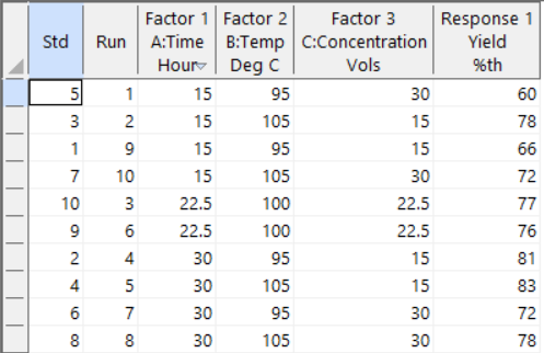
Now that you have set up your experiment and acquired your data, we can use Design-Expert software to analyse and interpret your results.
On the left-hand side of the Design-Expert dashboard is the navigator tree for the project. The first section consists of the Design (Actual), which contains our data table. The second Information section shows the tools to evaluate the design and results including:
- A notes text box allowing you to add any useful comments,
- A summary of the design and results including some basic descriptive statistics,
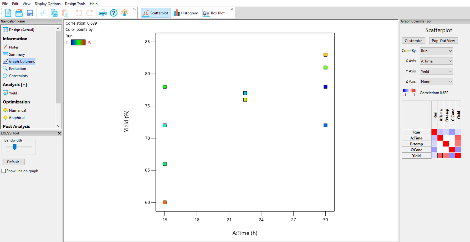
- A graphing tool to plot the data (Figure 1),
- An evaluation tool to check the overall design and errors,
- A constraints tool which allows you to exclude combinations of factors at a vertex that will not produce a useful or measurable response.
Start your analysis by visualising your results in a graph. To do this go to Graph Columns in the Information section. A coloured grid will appear on the right-hand side of the screen which shows the correlation between the factors and responses. The correlation coefficient is also displayed just above the grid. Select your x and y axis variables by selecting the appropriate square on the grid, or by using the drop-down lists above. On a graph of your response (Yield) versus each of your factors you can decide whether you have reasonable signal to noise from the distance between the centre points compared to the distance between the response at low and high factor settings.
Next, you should fit models to each of your responses. To do this, go to the Analysis section on the left-hand navigator and select the response “Yield”. The Analysis (+) option allows you to save more than one model for each response.
Once you have selected the Yield response, a Configure window appears (figure 2). This contains options for transformation of your data. There are two choices depending on whether you are expecting a linear response (Linear Regression) where the error of the model fitted (the residuals) is related to the size of the response, or you have count data, where a Poisson Regression can be fitted (Special Models).
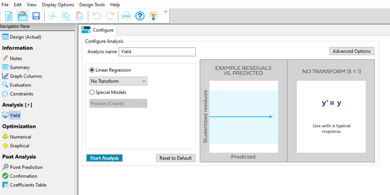
If your data analysis plan / prior knowledge means that the response requires transformation, then apply it here. Within the Linear Regression option there are a collection of power transformations available (Figure 3).
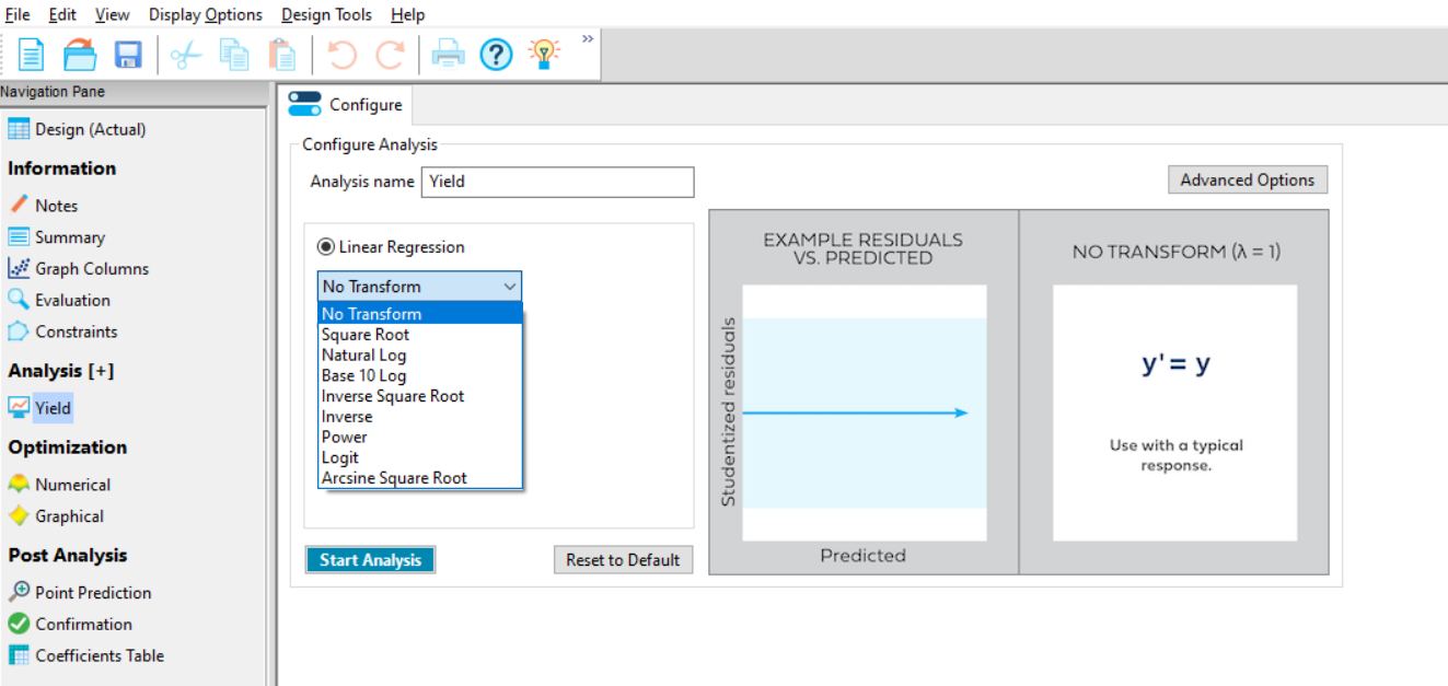
If you have no prior knowledge of the need to transform, then don’t transform initially; you can evaluate the need for transformation in the Diagnostics tab later. During this analysis we do not yet know whether a transformation is required, so click the Start Analysis box at the bottom left of the page.
A selection of tabs will appear (Figure 4). Reading from left to right these are:
- Configure (as discussed above)
- Effects
- ANOVA
- Diagnostics
- Model Graphs
You will automatically be in the second tab window (Effects). To perform your analysis, simply continue to work from left to right along the tabs.
The Effects tab contains 4 additional options. These are:
- Half-Normal
- Normal
- Pareto
- Numeric
You can manually select the effects (factors and interactions) that are influencing your response. To do this, make sure you are using the Half-Normal Plot (Figure 4, left default option) and Pareto Plot (Figure 4 right default option) to evaluate which effects are important. These can be displayed together using the split screen options for 2 plots on the ribbon above the analysis tabs. On the effects plot each square on the chart represents an effect that you could include in your model:
- The red line fitted to the smallest effects shows you the sizes of effects that are likely to be random (model-dependent) noise. To the right of the red line, standardised effects larger than background noise can be observed. The further to the right an effect appears, the larger an effect it is having on the current response.
- Select the effects that appear to be significantly larger than the background noise – in the case of the current experiment, these appear to be A, B, C and AB – either by using the cursor to draw a box around them, or by clicking on them individually.
- The red line sometimes moves if you select effects that are in the “grey area” between signal and noise. This example appears to have a clear separation between the noise terms on the left of the graph, and the significant effects on the right – but, in practice, it is not always so clear-cut!
- The effect symbols sometimes move as you select effects. This only happens if your design is not orthogonal, which is not the case in this Full Factorial example.
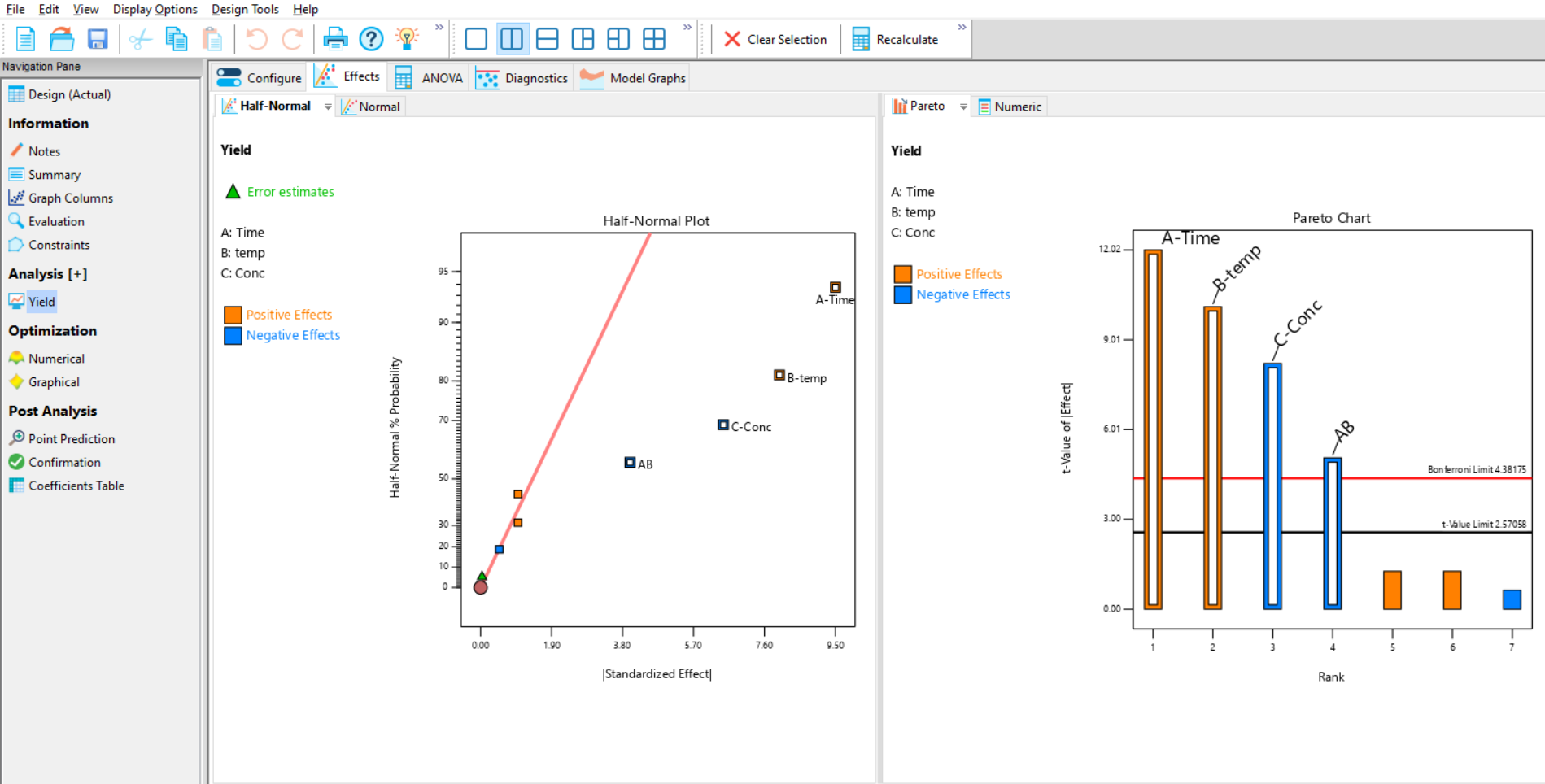
The Pareto chart (Figure 4; right plot) orders the effects by size and displays the 5% significance threshold (t-value limit) and an additional threshold corrected for multiple testing (Bonferroni limit). It is easier to use the half normal plot first and then check your selection using the Pareto chart to help with any ambiguities. If the selected (outlined) effects are larger than the red Bonferroni limit, then you can be confident that they are strongly statistically significant.
Now that you have selected the important effects, move on to the ANOVA tab. This will perform an Analysis of Variance (ANOVA) on your data, and is also where you will find the model information for this analysis. By selecting the model effects on the previous tab, you have now generated a linear model that can be used to predict your response (Figure 5).
For information about the results presented in the output, you can also click the light bulb icon on the main toolbar to display context-sensitive Help documentation at any point.
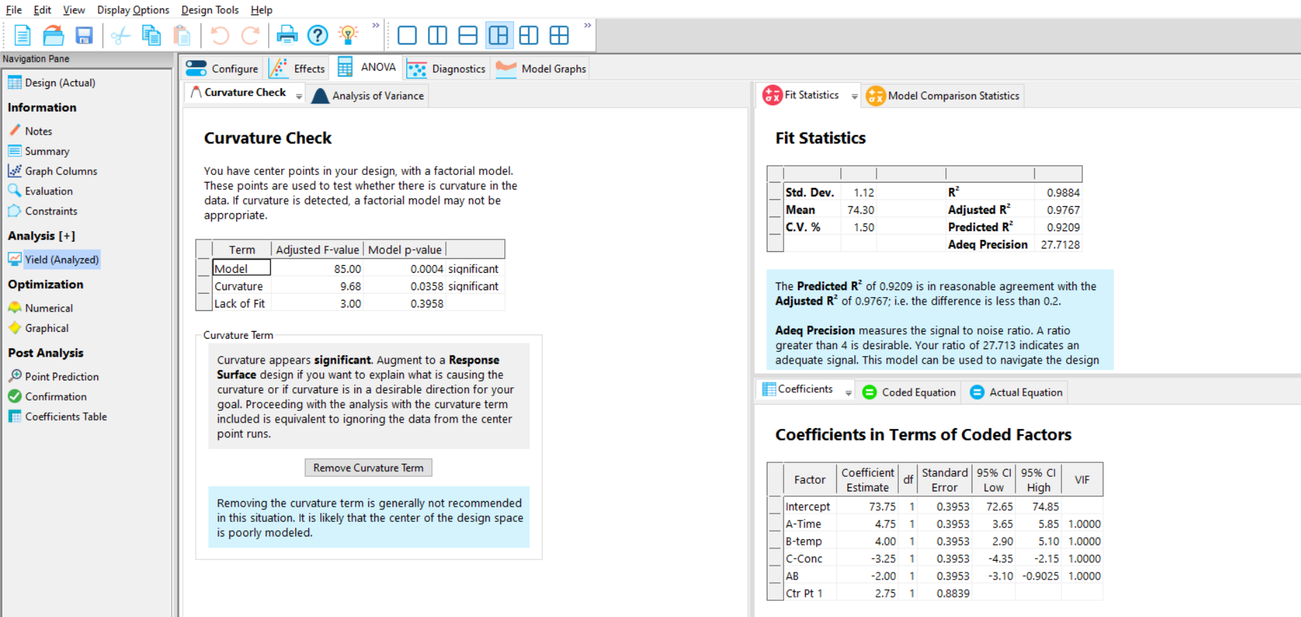
If the dataset includes centre points, then the Curvature p-value (Figure 5, left) will be reported. If the p-value for curvature in the ANOVA summary is statistically significant (generally defined as being <0.05), then this means that there is evidence of a non-linear relationship between the current response and at least one of the factors. If curvature is indicated from the p value, then use the default table shown on the “Analysis of Variance” tab. However, if the curvature p-value is above 0.05, then remove this term from the analysis by clicking the box “Remove Curvature Term” (instead of testing for curvature, the CPs will instead be used to help estimate the noise). Please note that centre points included in Factorial designs do not model the observed curvature; they simply test for evidence of it (to model the curvature, a more complex Response Surface design is required). If the curvature is removed the front page of the ANOVA results is removed leaving only the second page (Figure 6).
Remember that the p-value is not an absolute cut-off, but a sliding scale. To assess curvature you can also compare the Ctr Pt 1 coefficient (2.75) with the intercept (73.75) – see bottom right menu in Figure 5. These are both in the actual units of the response, so you can see how much the observed centre points (Ctr Pt 1) differ from their model-predicted values (intercept).
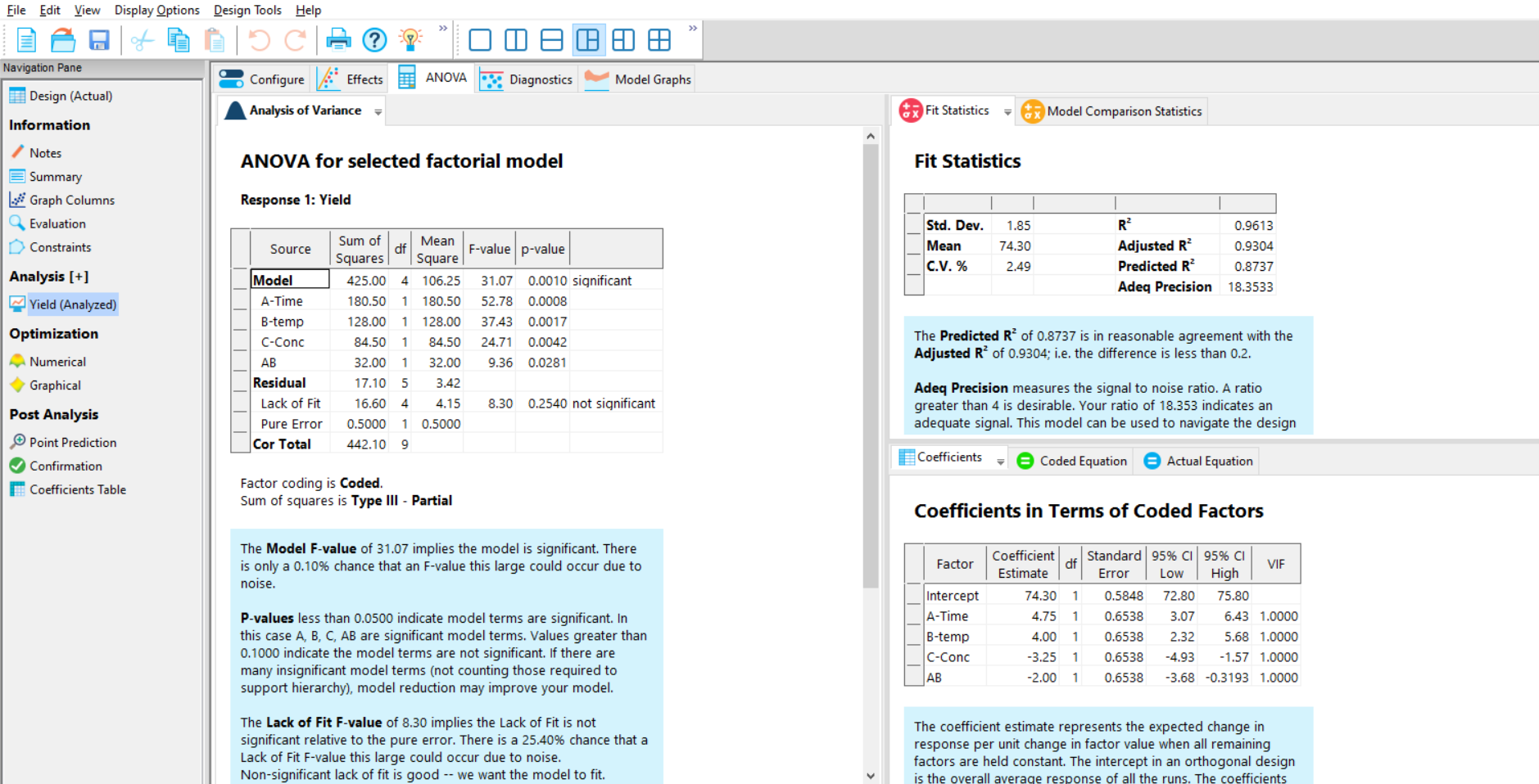
The next figures that need to be checked are the p-values in the Model summary (Figure 6, left) for the effects that you selected on the effects plot. They are generally considered to be statistically significant if their p-value is <0.05 (but remember that this is an arbitrary cut-off, and in some cases you may wish to make this cut-off more or less stringent).
Next check the R-Squared, Adj R-Squared and Pred R-Squared metrics (Figure 6, top right). The R-Squared explains how much of the variation observed in the response has been explained by the selected model; the higher, the better (note – the R-Squared value will be application-dependent). The Adj R-Squared is the R-Squared adjusted for the number of model terms; it decreases as irrelevant terms are added. Finally, the Pred R-Squared value indicates how well future observations may be predicted. Check that the Adj R-Squared and Pred R-Squared values are in reasonable agreement with one another; the rule of thumb is that if they differ by more than 0.2, then there may be an issue with the data or model.
The next step is to verify that the model assumptions have not been violated. The model assumptions include that you have normally-distributed residuals. It is also sensible to check that there are no outliers. There are several diagnostic checks to assess the “residuals” – these are the set of differences between the observed response values and the expected values, according to the predictions made by the selected model.
To check the Diagnostics, move along to the next tab, where the most commonly used residual plots are shown as defaults (Figure 7). Other options are also shown in tabs behind these defaults. The Normal Plot of Residuals is initially displayed (Figure 7). This compares the distribution of the residuals to a normal distribution (straight line). Check that there are no obvious patterns (e.g. s-shaped), which could suggest that the data would benefit from a transformation.
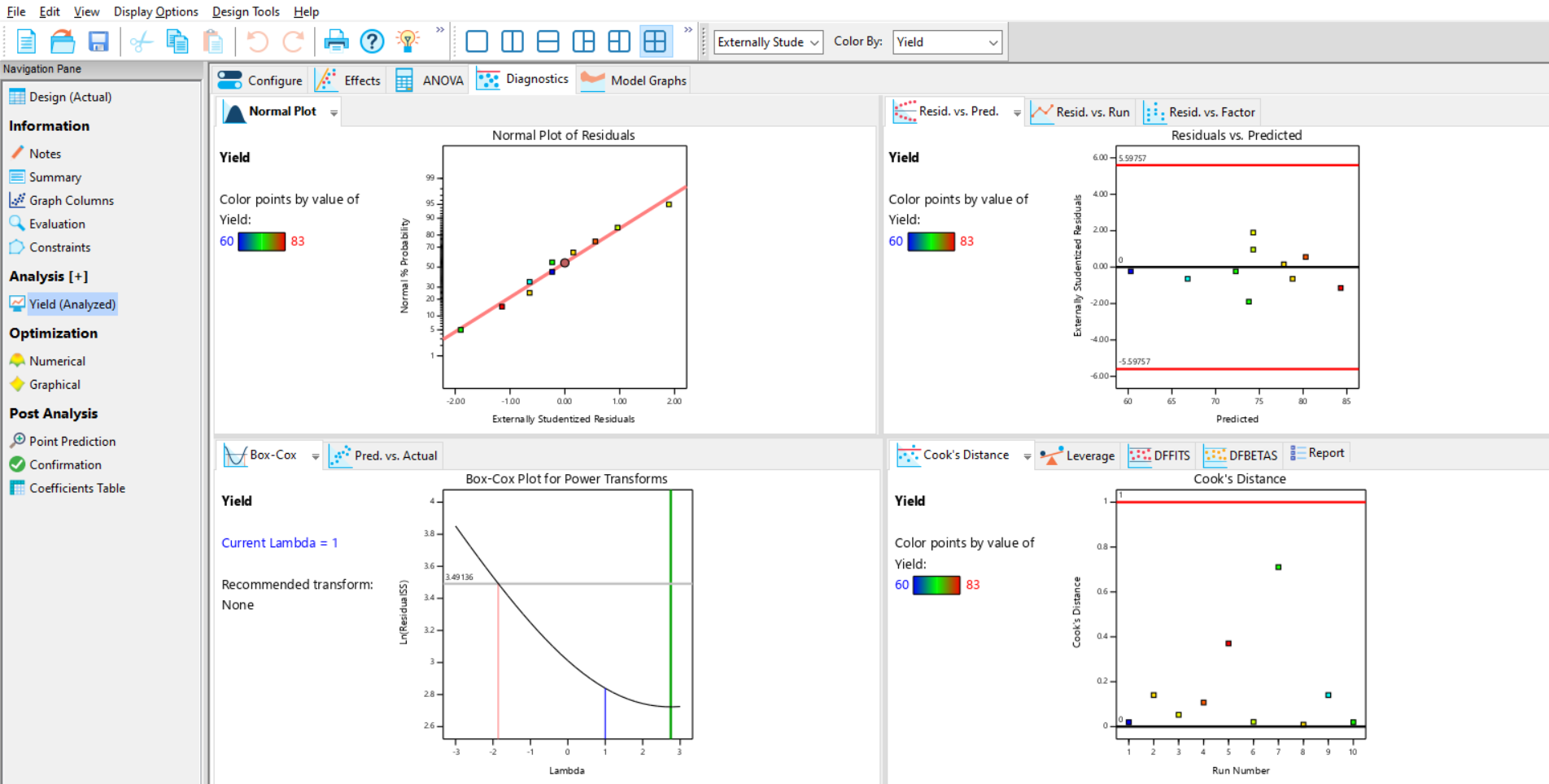
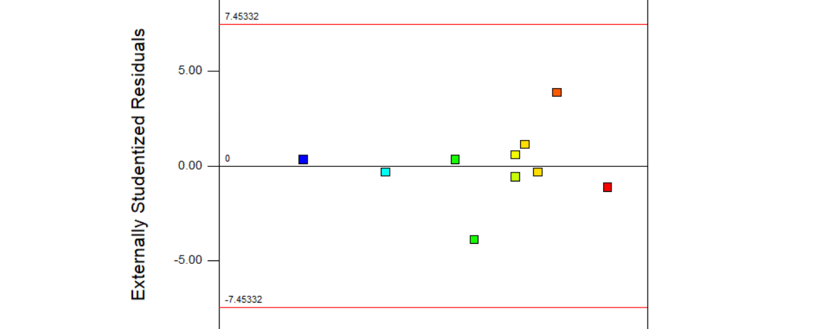
Next, observe the Residuals vs Predicted graph (”Residuals vs. Predicted”). This checks for consistent variation across the prediction range and should show a random scatter of predicted residuals centred on zero; if this is not the case then a transformation might be needed. It is also possible to identify outliers on this plot – they will appear outside the warning limits indicated by the horizontal red lines.
There are other plots which may also be useful to you in this section, especially if you are trying to detect run order effects (for this, try the Residuals versus Run chart tab behind the resid vs pred graph).
Observe the Box-Cox Plot to gain more insight into whether you should transform your data. This applies a series of power transformations to your data, and then measures the residual variation for each. The log of the residual variation is plotted, and the optimum transform is where the log residual (y axis) is at its lowest. To interpret the Box-Cox plot:
- Check where the position of the best transform (green line) is relative to the currently-applied transformation (blue line). If they are close/within the 95% confidence interval (red lines) then no transform is needed.
- Transformations are also recommended in text to the left of the plot – Design-Expert helpfully suggests the best standard transformation for the current data and model. In this example, it recommends “None” (i.e. no transformation required).
- If a transformation is required, then return to the Configure tab to apply the recommended transform using the linear regression pull-down menu, then repeat the effects selection and ANOVA steps.
As the diagnostics show no cause for concern in this example, proceed to the next tab (Model Graphs).
There are several different graphs to help you analyse your data which appear as icons on the top ribbon of the model graphs display:
- Perturbation plots help you visualise all factors on the same plot at a particular point in the design space
The one factor, all factors and interactions plots show the effects of one, all or interacting factors respectively. - The contour and 3D surface plot visualise the response over 2 factors is particularly useful for response surface designs.
- The Factors tool appears to the right of the screen and allows you to change what is on the plot, and interactively look at the effect of other factors on the plot.
We selected the AB interaction on the Half-Normal Plot earlier, so the Interaction Plot will be shown by default (Figure 8). If no interactions were selected, then the One Factor plot will be shown by default (in this example, you can select this manually if you want to view individual effects).
You can change the effect plotted by right clicking on the slide bar of the desired factor on the factors tool, and selecting which axis to plot the factor on.
While viewing the interaction plot, you can use the slide bar for C to find the conditions for optimal yield (Figure 8).
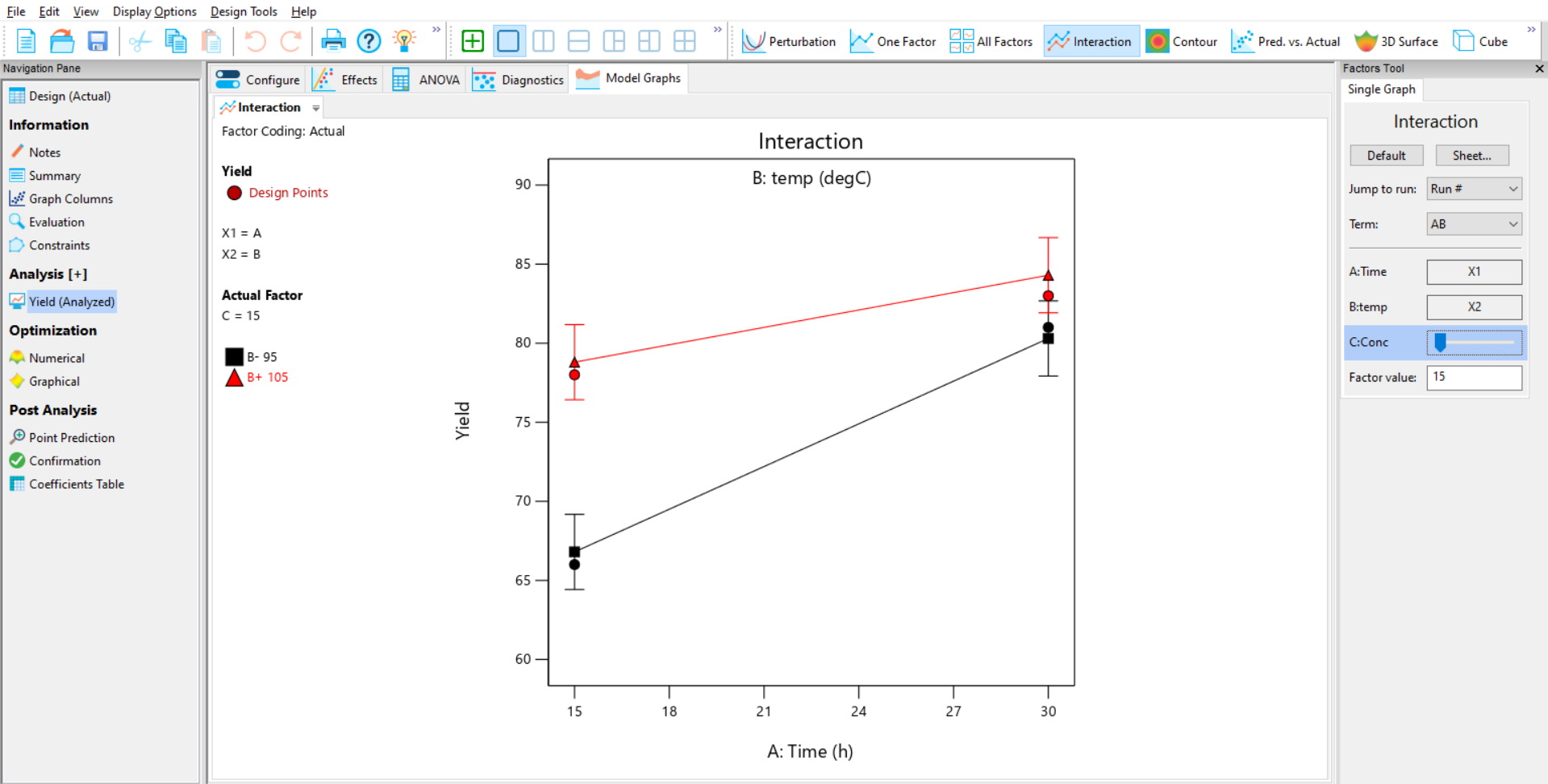
By observing the interaction between A and B, and using the slide bar to optimise C, it is clear that to maximise yield it is necessary to have the high settings of time (A) and temperature (B) and the low setting of concentration (C).
Congratulations – you’ve now analysed your study in Design-Expert!
If you found this guide useful, or are interested in the wide range of Design of Experiments workshops we offer, please contact us. We'd love to hear from you.
Be the first to know about new blogs, upcoming courses, events, news and offers by joining our mailing list here.

